Theme Settings
Introduction
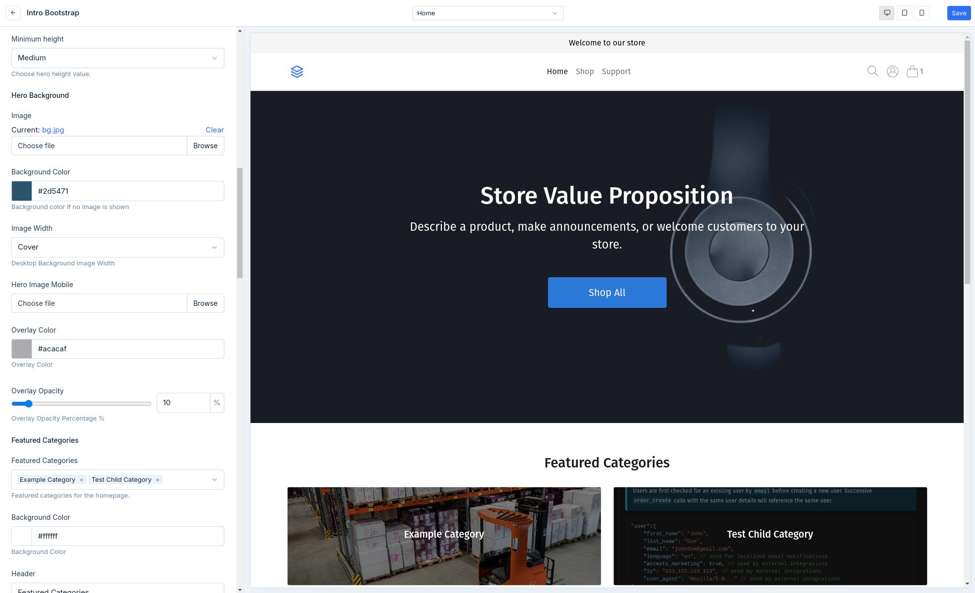
Theme settings are the power behind the dashboard theme editor experience allowing users to customize the look and feel of their storefront without needing to know how to code.
Theme Settings Location
Theme settings consist of two JSON files in the /configs directory.
configs
  └── settings_schema.json
  └── settings_data.json
settings_schema.json- Used to create the settings schema to create settings shown in the dashboard theme editor.settings_data.json- Used to store theme settings values for access in templates for rendering.
Using Settings in Templates
Settings are passed to templates settings context variable allowing you to access settings values by their name. See example below of changing the layout by conditionally adding a class based on a radio setting.
- Settings Schema
- Template
{
    "General": {
        "Settings": [
            {
                "name": "store_name",
                "label": "Store Name",
                "help_text": "Public name of your store.",
                "type": "text",
                "max_length": 250,
                "required": 1,
                "default": "Store Name"
            },
            {
                "name": "layout",
                "label": "Layout Style",
                "help_text": "Control the layout style.",
                "type": "radio",
                "options": [
                    {
                        "name": "Boxed",
                        "value": "boxed"
                    },
                    {
                        "name": "Full Width",
                        "value": "full"
                    }
                ],
                "default": "boxed"
            }
        ]
    }
}
<div class="{% if settings.layout == 'boxed' %}container{% endif %}">
    <h1>Welcome to {{ settings.store_name }}!</h1>
    <div>Conditionally boxed or full width content</div>
</div>
Attribute Reference
| Attribute | Required | Description |
|---|---|---|
type | Yes | Type of form input, see Schema Input Types. |
name | Yes | Name of the setting and key for access in template settings object variable. |
label | Yes | Theme settings form input label. |
help_text | No | Theme settings form input help text that shows below the input. |
required | No | JSON boolean, accepts true or false, false by default. |
default | No | Default value for the setting. |
options | No | List of key:value pairs for options. Applicable to radio and select field types for their choices. |
max_length | No | Applicable to text field types to limit the length of text input. |
max_value | No | Applicable to number field types to limit the max value. |
min_value | No | Applicable to number field types to set a min value. |
Schema Input Types
Schema input types map to input fields that will be rendered in the settings form in the dashboard.
checkbox
A checkbox setting outputs a checkbox field input for use cases such as toggling features on and off.
When accessing a checkbox field value in a template, it returns boolean.
{
    "name": "enable_cookie_msg",
    "label": "Enable Cookie Message Pop",
    "help_text": "Enable cookie message to site visitors.",
    "type": "checkbox",
    "default": true
}
color
A color setting outputs a color picker field allowing the user to chose a color for cases such as customizing font and button styles.
When accessing a color field value in a template, it returns a hex value as a string.
{
    "type": "color",
    "name": "btn_primary_color",
    "label": "Primary Button Color",
    "help_text": "Primary color for buttons.",
    "default": ""
}
css
A css setting outputs an css code editor allowing the user to add custom css in a nicely formatted editor for cases such as custom css styles.
When accessing a css field value in a template, it returns the a string with the css pre-wrapped with <style></style> tags.
{
    "type": "css",
    "name": "custom_css",
    "label": "Custom CSS",
    "help_text": "Example css input."
}
email
A email setting outputs a email field allowing the user to add validated email text for cases of showing a contact email.
When accessing a email field value in a template, it returns a string.
{
    "type": "email",
    "name": "contact_email_address",
    "label": "Public contact email address.",
    "help_text": "Email to show in site footer.",
    "default": ""
}
file
A file setting outputs a file upload input field allowing the user to upload files for scenarios such as a homepage banner background image.
When accessing a file field value in a template, it returns a full CDN link to the uploaded file.
{
    "type": "file",
    "name": "logo",
    "label": "Store Logo",
    "help_text": "Primary logo used throughout the site.",
    "default": "uploads/logo.png"
}
html
A html setting outputs an html code editor allowing the user to add custom html in a nicely formatted editor for cases such as code snippets or video embeds.
When accessing a html field value in a template, it returns the html content string.
{
    "type": "html",
    "name": "custom_html",
    "label": "Custom HTML",
    "help_text": "Example html input."
}
image_picker
An image_picker setting outputs outputs an image picker modal making all uploaded image assets available to select from.
{
"name": "example_image_picker",
"label": "Example Image Field",
"type": "image_picker",
"required": false
}
menu
A menu setting field outputs a dropdown select field to choose from the available navigation menus.
When accessing a menu setting value in a template, it returns a menu object allowing you to access the menus items. See menus object details for working with menus in templates.
{
    "name": "header_menu",
    "label": "Header Menu",
    "type": "menu",
    "required": true,
    "help_text": "Header Menu"
}
multi-select
A multi-select setting outputs a multi-select field that can allows users to select multiple values from a predefined list of options.
When accessing a multi-select field value in a template, it returns a list of values that have been saved.
{
    "type": "select",
    "multi-select": true,
    "name": "accepted_payment_methods",
    "label": "Accepted Payment Methods",
    "help_text": "Control which payment methods are shown.",
    "options": [
        {
            "name": "Visa",
            "value": "visa"
        },
        {
            "name": "Master Card",
            "value": "mastercard"
        },
        {
            "name": "American Express",
            "value": "amex"
        },
        {
            "name": "Paypal",
            "value": "paypal"
        },
        {
            "name": "Klarna",
            "value": "klarna"
        }
    ],
    "default": [
        "visa",
        "mastercard"
    ]
}
number
A number setting field outputs a standard number input field allowing users to input a number respecting the optionally available min and max values.
When accessing a number setting value in a template, it's returned as an integer.
{
    "type": "number",
    "name": "homepage_testimonials_count",
    "label": "Homepage Number Testimonials to Show",
    "help_text": "Control the number of homepage testimonials to show",
    "max_value": 10,
    "min_value": 0,
    "default": 3
}
page
A page setting field outputs a dropdown select field to choose from the available pages.
When accessing a page setting value in a template, it returns a page object. See page object details for working with pages in templates.
{
    "type": "page",
    "name": "page_setting",
    "label": "Example Setting Page",
    "help_text": "Link to page configured from settings."
}
product
A product setting field outputs a dropdown select field to choose from the available products in the store catalogue.
When accessing a product setting value in a template, it returns a product object. See product object details for working with products in templates.
{
    "name": "hero_product",
    "label": "Hero Product",
    "type": "product",
    "help_text": "Hero product on homepage banner.",
    "required": false
}
products
A products setting field outputs a multi-select field to choose from the available products in the store catalogue.
When accessing a products setting value in a template, it returns a list of products to iterate through. See product object details for working with products in templates.
{
    "name": "featured_products",
    "label": "Featured Products",
    "type": "products",
    "help_text": "Featured products for homepage."
}
product_category
A product_category setting field outputs a dropdown select field to choose from the available product categories.
When accessing a product_category setting value in a template, it returns a product category object. See product category object details for working with product categories in templates.
{
    "name": "featured_products",
    "label": "Featured Product Category",
    "type": "product_category",
    "help_text": "Featured product category for homepage"
}
product_categories
A product_categories setting field outputs a multi-select field to choose from the available product categories.
When accessing a product_categories setting value in a template, it returns a list of product categories to iterate through. See product category object details for working with product categories in templates.
{
    "name": "top_product_categories",
    "label": "Top Product Categories",
    "type": "product_categories",
    "help_text": "Featured product categories for homepage"
}
radio
A radio setting outputs a radio option field that can be used in option selection scenarios such as alignment or layout style.
When accessing a radio setting value in a template, it's returned as a string.
{
    "type": "radio",
    "name": "layout",
    "label": "Layout Style",
    "help_text": "Control the layout style.",
    "options": [
        {
            "name": "Boxed",
            "value": "boxed"
        },
        {
            "name": "Full Width",
            "value": "full"
        }
    ],
    "default": "boxed"
}
range
A range setting outputs a slider that can be used to a varying numerical value such as font size, number of columns or opacity.
When accessing a range setting value in a template, it's returned as an integer.
{
    "type": "range",
    "name": "slider_range_field",
    "label": "Headings font size",
    "help_text": "",
    "min": 0,
    "max": 50,
    "step": 1,
    "unit": "px",
    "required": true,
    "default": 25
}
richtext
A richtext setting displays a WYSIWYG editor with basic text formatting options allowing users to input and format text content.
When accessing a richtext setting value in a template, it's returned as a string.
{
    "type": "richtext",
    "name": "richtext_content",
    "label": "Description Content",
    "help_text": "Example rich text input field."
}
select
A select setting outputs a dropdown option select field that can be used in option selection scenarios such as alignment or layout style.
When accessing a select setting value in a template, it's returned as a string.
{
    "type": "select",
    "name": "header_style",
    "label": "Header Style",
    "help_text": "Choose header layout style.",
    "options": [
        {
            "name": "Full Width",
            "value": "full"
        },
        {
            "name": "Boxed",
            "value": "boxed"
        },
        {
            "name": "Overlay",
            "value": "overlay"
        }
    ],
    "default": "full"
}
text
A text setting outputs a single line input field that can be used in scenarios such as the banner heading text on the homepage.
When accessing a text setting value in a template, it's returned as a string.
{
    "type": "text",
    "name": "store_name",
    "label": "Store Name",
    "help_text": "Public name for your store.",
    "max_length": 250,
    "required": true,
    "default": "My New Store Name"
}
textarea
A textarea setting outputs a multi-line textarea input field that can be used in scenarios such as the banner sub-heading text on the homepage.
When accessing a textarea setting value in a template, it's returned as a string.
{
    "type": "textarea",
    "name": "description",
    "label": "Description",
    "help_text": "Example input textarea",
    "default": "Example long multi-line sub-heading text for the banner."
}
url
A url setting outputs an input url type field that accepts fully qualified urls that can be used for relative paths or external url links.
When accessing a url setting value in a template, it's returned as a string.
{
    "type": "url",
    "name": "social_link",
    "label": "Social Media Link",
    "help_text": "Link to your social media page.",
    "default": ""
}